Design Principle / Project 2

18.10.2020 -30.10.2020 (week 8 - week 10)
Phoebie Ng / 0341172 / Bachelor of creative media
Design principles
Project 2- sense of place
Phoebie Ng / 0341172 / Bachelor of creative media
Design principles
Project 2- sense of place
LECTURES
Observation: An active act of acquiring information, through the senses, of a subject matter in its natural setting.
Observation is important to designers as it enables them to see problems, as well as getting ideas for solutions to those problems.
 |
| fig 1,1 painting by Vincent Van Gogh 21/10/2020 |
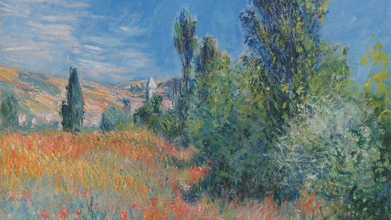 |
| fig 1.2 painting by Monet 21/2020 |
This is another painting example from Monet that can see that it is not realistic but by observing the place and turn it to painting.
INSTRUCTIONS
TASK
research
photo taking
 |
| fig 2.1 photo taking around my house 31/10/2020 |
visual research
 |
| fig 2.2 visual research on Pinterest 31/10/2020 |
idea explorations
 |
| fig 2.3 sketch 1 31/10/2020 |
 |
| fig 2.4 sketch 2 31/10/2020 |
 |
| fig 2.4 sketch 3 31/10/2020 |
Here are some of the sketches that I sketched. I had included some sea creatures as I think it is really interesting when I did the visual research. I had decided to use sketch 3 as my final.
progression
 |
| fig 2.5 progression 1 31/10/2020 |
I had used sketch 3 as my final. This is my progression during week 9.
 |
| fig 2.6 progression 2 31/10/2020 |
 |
| fig 2.7 progression 3 31/10/2020 |
 |
| fig 2.8 progression 4 31/10/2020 |
 |
| fig 2.9 progression 5 31/10/2020 |
I also did some color filter, because the color accuracy of my laptop is not that good after I had compared it with my Ipad.
 |
| fig 2.10 final outcome 31/10/2020 |
This is the final outcome of my final project. I had used my room as reference and produced this art work. I had imagined it as a combination of undersea and my room from the inspiration of my visual research. I think it is really interesting to imagine you are sleeping with all of the sea creature, it's like living under the sea. I had added an animal that are not really the same thing as I drew which is the cat because I love cat a lot but I never own one. I had used a color combination of blue and orange because I think it is a good combination. Blue represent depress and sad. Orange represent fun and cheerful. I want to show that everything have it's different side.
The design principle that I had applied:
golden ratio: I had apply golden ratio on this artwork and place the cat which I want to emphasis at the golden ratio point.
harmony: I had used complementary color for overall artwork.
emphasis: I had used different color for the cat to emphasis it.
repetition: repeat of fishes and bubble.
movement: the position of the fish and turtle moving the same way.
FEEDBACK
week 9: Ms. Maria looked at my progression and she said she like it. She look how the color look like and there's no comment on it.
week 10: Ms. Maria said that I could fill in the bottom of the sea bed more.
REFLECTION
Experience: Throughout this exercise, I had gain experience on using photoshop and different blending mode while using brush together. Because of the color accuracy of my laptop, I need to rework on my work for a few times to make it looks like the color that I want to show. I was really disappointed and sad at that time because I need to rework with the color filter again and again to get the color that I want.
Observation: I noticed that it really save my time using photoshop to draw than during it manually because I don't need to wait the paint to dry.
Finding: I found that it is really important to organize your stuff into each folder in your laptop file. For the past few project, I didn't organize my work into each file and it takes me sometimes to find the things that I want to insert in my blog. So organize your file is really important.


Comments
Post a Comment