ADVANCED TYPOGRAPHY / TASK 1: EXERCISES - TYPOGRAPHIC SYSTEM & FINDING TYPE


29.3.2021 -30.1.2021 (week 1 - week 4) 
Phoebie Ng / 0341172 / Bachelor of creative media
Advance Typography / Exercises - Typographic system & Finding Type

LECTURE NOTES

week 1 (29.3.2021)
Mr. Vinod brief us about how the Facebook group work, which I was also brief in my semester 1. 
  • There are some book for us to read as further reading in the Facebook group file.
  •  At the announcement section, we have our feedback sheet.  
  • We need to paste our e portfolio link in the comment section. 
  • Lecture playlist is in the announcement section.
MIB assignments notes
  • 'don't chase the grade, chase the learning'
  • there were recommending reading in MIB for us to read
  • Task 1 is divided into 2 parts. 
  • Task 2 is like a logo but a little bit more visualize, key artwork. Not a poster. 
  • Task 2 (B) is applying the key artwork to the collaterals 
  • Task 3 is the Final Project. This is important. Think about what the usage be. The use doesn't have to be on printing. 

Lecture 1: Typographic systems
All design is based on a structural system. There are eight major variations according to Elam which are :
  • Axial
  • Radial 
  • Dilatational
  • Random
  • Grid 
  • Modular
  • Transitional 
  • Bilateral
Typographical organization is complex because the elements are dependent on communication in order to function. Hierarchy, order of reading, legibility and contras are the additional criteria. The typographic systems are similar to what the architect term shape grammars. They are similar but not the same.  It's the system has a sets of rules that provide a sense of purpose that focuses and direct the decision making. It provide a solid frame work for the learner. 

Axial system: all the elements are organized to the left or right of a single axis, it doesn't have to be straight. 
Radial system: All elements are extended from a point of focus. 
Dilatational system: All elements expand from a central point in a circular fashion. It could b simple or complex. 
Random system: elements appear to have no specific pattern or relationship. 
Grid system: A system of vertical and horizontal divisions. 
Transition system: An informal system of layered banding. The differences of the size and the width is also important to create hierarchy. 
Modular system: A series of non- objective elements that are constructed in as a standardized units. The unit can be randomly place even though not within a larger grid. 
Bilateral system: All text is arranged symmetrically on a single axis. 

"Typography is the use of type to advocate, communicate, celebrate, educate, elaborate, illuminate, and disseminate. Along the way, the words and pages become art." -- James Felici, The complete Manual of Typography. 

week 3 (12.4.2021)
Lecture 2: Typographic composition
Principles of Design Composition
When it comes to translating the abstract notions like emphasis, isolation, repetition ,symmetry and asymmetry, alignment, perspective seems ambiguous. They seem more relevant to imagery than complex units of information that consist different elements. 

The rule of thirds is a photographic guide to composition, it suggest that a frame can be divide to 3 columns and rows. But it was rarely use.

The most used system is the Grid system from the 8 systems. 
It was further enhanced by it is now come to be termed a the Swiss style of Typography. 

Chaos, Randomness and symmetry were explore during the past-modernist era in Typographic system. Davi Carson, Paula Soher, Jonathan Barnbrook are the bests examples seems to combine Legibility and readability seamlessly.

Environment Grid is based on the exploration of an existing structure or numerous structures combined. An extraction of crucial lines both curved and straight are formed. The designer organizes his information around the super- structure, which includes non objective elements to create a unique and exciting mixture of texture and visual stimuli. 

Form and Movement is based on the exploraton o an existing Grid Systems. Th placement of a form on  page, over many page creates movement.

'There is a fine line between genius and insanity, just as there is a fine line between legibility-readlity & memorability.'  

Lecture 3: Context & Creativity 

Handwriting is important in the study of typography because it is the first mechanically produced letterforms were designed to directly imitate handwriting. Is is the basis or standard for form, spacing and conventions mechanical type would try and mimic. 

With the digital revolution, the west would begin to digitize many of it's historical creations and type foundries would create, market and sell of license them.

Creativity and originality are properties that are most often intertwined. It is important or us to look inward and examine their histories, civilization, culture and communities to bring these past developments into the future and develop on our intead of blindly appropriating cultures and developments that have no context, relatability or relevance.

'Looking behind gives you context. Looking foward gives you opportunities.' - Mr. Vinod

Lecture 4: Context & Creativity 
In this lecture video, Mr Vinod taught us about the process of designing type. The process of Adrian Frutiger, Matthew Carter, Edward Johnstan creating thier typefaces. 

Designing typefaces because  type design carries a social responsibility so one must continue to improve it's legibility. Type design is a form of artistic expression.

General Process of Type Design:
1. Research - understand the type history, type anatomy and type conventions. Examine existing fonts that are presently being used inspiration.
2. Sketching - using traditional tool or digital tool sets
3. Digitization - professional software like Fontlab and Glyphs App
4. Testing - the readability and legibility of the typeface becomes an important consideration.
5. Deploy - the rigour of the testing is important in so that the teethin issue remain minor.

'The mindset of a type designer - if clinically studied - might be construed as sick; plagued by an unusual obsession to detail.' -- Mr. Vinod

Lecture 5: Perception and Organization
Perception is typography deals with the visual navigation and interpretation of the reader via contrast, form and organization of the content.

Form is the part play the role in visual impact and first impression.
Displaying type as a form provides a sense of letterforms' unique characteristics and abstract presentation.

Gestalt theory emphasizes that the whole anything is greater that its part.
The Law of similarity is the gestalt grouping law that states that elements that are similar to each other tend to be perceived as a unified group. 
The Law of Proximity is the gestalt grouping law that states element s that are close together tend to be perceived as a unified group.
The Law of Closure refers to the mind's tendency to see complete figures or form. 
Law of (Good) Continuation holds that humans tend to perceive each of two or more objects as different, singular, and uninterrupted abject even when they intersect.

'The organization of information and how it is perceived should be considered by designers as a social responsibility - crucial for effective communication, transfer of knowledge and for understanding to occur.' -- Mr. Vinod.


INSTRUCTIONS

<iframe src="https://drive.google.com/file/d/1sIcHEeyNb7ayZTosPFnpOgeWr0GpuyyM/preview" width="640" height="480"></iframe>
fig 2.1: Module Information Booklet (1.4.2021)


TASK 1

week 1 (29.3.2021)
  • Hierarchy of placing the information, which one should the reader read first
  • placement of the information, how the reader will see the whole picture and read. 
  • Introduction of 1 colors, do not introduce the color before the layout is done. 
  • type setting, what should be the right type size, leading, tracking. The point size should be between 8-12pt.
  • Use anyone of the 3 title in each system that need to be relevant. 
  • must have proper grid in proper guides, create guides and columns, fit the guides to margin 
  • the unit need to be place according the margin and in the cell. 
For exercise 1, we need to do 8 square poster according to the 8 typographic system. Below is the notes that I took in class. 
  • Hierarchy of placing the information, which one should the reader read first
  • placement of the information, how the reader will see the whole picture and read. 
  • Introduction of 1 colors, do not introduce the color before the layout is done. 
  • type setting, what should be the right type size, leading, tracking. The point size should be between 8-12pt.
  • Use any of the 3 title in each system that need to be relevant. 
  • must have proper grid in proper guides, create guides and columns, fit the guides to margin 
  • the unit need to be place according the margin and in the cell. 
fig 1.1 axial typographic system 1st attempt 29.3.2021

fig 1.2 axial typographic system 2nd attempt 29.3.2021

Above are the attempts that I did for axis typographic system in class. However, I am not satisfied with it, so I tried some other attempts. Mr. Vinod also gave the feedback of we should be aware of using too light colors to take care of the contrast, so I changed my color from yellow to green. Below are the spread of my attempts. 

Progression

fig 1.3 progression 4.4.2021

fig 1.4 progression 4.4.2021

fig 1.5 progression 4.4.2021

fig 1.6 progression 4.4.2021


fig 1.7 axial typographic system attempt 3 & attempt 4 (4.4.2021)

fig 1.8 axial typographic system attempt 5 & attempt 6 (4.4.2021)

fig 1.9 axial typographic system attempt 7 & attempt 8 (4.4.2021)

fig 1.10 radial typographic system attempt 1 & attempt 2 (4.4.2021)

fig 1.11 radial typographic system attempt 3 & attempt 4 (4.4.2021)

fig 1.12 radial typographic system attempt 5 (4.4.2021)

fig 1.13 Bilateral typographic system attempt 1 & attempt 2 (4.4.2021)


fig 1.14 Bilateral typographic system attempt 3 & attempt 4 (4.4.2021)


fig 1.15 grid typographic system attempt 1 & attempt 2 (4.4.2021)

fig 1.16 grid typographic system attempt 3 (4.4.2021)

fig 1.17 Dilatation typographic system attempt 1 & attempt 2 (4.4.2021)

fig 1.18 Dilatation typographic system attempt 3 & attempt 4 (4.4.2021)

fig 1.19 Modular typographic system attempt 1 & attempt 2 (4.4.2021)


fig 1.20 Random typographic system attempt 1 & attempt 2 (4.4.2021)

fig 1.21 Transitional typographic system attempt 1 & attempt 2 (4.4.2021)

fig 1.22 Transitional typographic system attempt 3 (4.4.2021)

FINAL OUTCOME

fig 1.23 Final Axial typographic system (5.4.2021)


fig 1.24 Final Radial typographic system (5.4.2021)


fig 1.25 Final Bilateral typographic system (5.4.2021)

fig 1.26 Final Dilatation typographic system (5.4.2021)

fig 1.26 Final Grid typographic system (5.4.2021)

fig 1.28 Final Modular typographic system (5.4.2021)


fig 1.29 Final Dilatation typographic system (5.4.2021)

fig 1.30 Final Transitional typographic system (5.4.2021)

fig 1.31 Final typographic system with grid pdf (5.4.2021)

fig 1.31 Final typographic system pdf (5.4.2021)

TASK 2: TYPE & PLAY : PART 1
week 2 (5.4.2021)
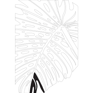
we were asked to find type from a picture that we choose, it can be nature, manmade things or the structure of the building. We need to create 5 letter form. Mr. Vinod show us our seniors blog and how the senior create their own font by the steps. Mr. Vinod suggested us to follow the steps of our seniors, to trace the image first, to know better on how letter can be see on the original and remember to put baseline as guides.

At the beginning, I try to find reference photo to find font from. I search up of pictures that have the possibility. As I was really got into those very impactful fonts, so I tend to find picture that has the possibility of making an impactful font. 

fig1.32 Photo reference 1 (10.4.2021)

fig1.33 Photo reference 2 (10.4.2021)

fig1.34 Photo reference 3 (10.4.2021)

fig1.35 Photo reference 4 (10.4.2021)

Here are the 4 photos that I found on Pinterest that I would like to use as a reference. From the 4, I picked reference 2 and reference 4 to find the fonts. I tried to trace both of them to see the possibility. 

 
fig 1.36 photo tracing 1 (10.4.2021)

fig 1.37 photo tracing 1 (10.4.2021)

fig 1.38 photo tracing progression (10.4.2021)

From fig 1.36 to 1.38, these are the progression of tracing the photo. After that, I choose reference 1 to proceed with the fond finding as while tracing, I found some very interesting alphabet shape. 

fig 1.39 alphabet A (10.4.2021)

fig 1.40 alphabet E (10.4.2021)

fig 1.41 alphabet N (10.4.2021)

fig 1.42 alphabet U (10.4.2021)

fig 1.43 alphabet P (10.4.2021)

fig 1.44 alphabet M (10.4.2021)

fig 1.45 alphabets extracted  (10.4.2021)

From the shape of the picture, these are the alphabets that I found. From all of them I found letter A and letter N the most interesting because of the special and dynamic shape. 

fig 1.46 letters on guides (11.4.2021)
fig 1.47 letters on guides (11.4.2021)

fig 1.48 refining letters according to the height  (11.4.2021)


fig 1.48 refining letters to have more consistent shape and stroke weight (11.4.2021)


fig 1.48 Impact font as reference (11.4.2021)

At this stage, I had use the font call 'Impact' to improve my font weight and consistency. 

fig 1.49 refining letters to have more consistent shape and stroke weight (11.4.2021)
fig 1.50 shapes that extract from the letter

fig 1.51 refining the stroke weight to thicker (11.4.2021)


fig 1.52  refining the letters to make it consistent (11.4.2021)

fig 1.53  refining the letters to avoid losing the element from the picture (11.4.2021)

fig 1.54 letter A evolution (11.4.2021)

fig 1.55 letter N evolution (11.4.2021)

fig 1.56 letter M evolution (11.4.2021)


DRAFT 1
fig 1.57  refining letter A, draft 1 (11.4.2021)

week 3 (12.4.2021)

This week, another week is given for our typeface refinement. As I had received positive feedback from my peers and Mr. Vinod. I don't have much things to do this week but I did some refinement on my typeface design, to make the stroke and adjust some mistake from last week. Below are my final attempt.

fig 1.59 final attempt on E (16.4.2021)

fig 1.60 final attempt on M (16.4.2021)

fig 1.61 final attempt on A (16.4.2021)

fig 1.62 final attempt on N (16.4.2021)

fig 1.63 final attempt on P (16.4.2021)

fig 1.64 final attempt on U (16.4.2021)


FINAL OUTCOME
fig 1.65 final outcome compilation (16.4.2021)

fig 1.66 individual letter final outcome pdf (16.4.2021)

fig 1.67 compilation letter final outcome pdf (16.4.2021)

week 4 (19.4.2021)
In this week  we were asked to combine a visual with a letter. The text must be woven into a symbiotic relationship with the image. 

We were asked to do the first attempt of this exercise in class for 30 minutes. I then did my first attempt. Below is my first attempt. 

fig 1.68 original picture of first attempt 25.4.2021

fig 1.69 first attempt 25.4.2021

As I am not satisfied with my first attempt, I try to find more picture and look at it's possibility to express the words. 

fig 1.70 original picture of second attempt 25.4.2021

fig 1.71 original picture of third attempt 25.4.2021

These are the 2 pictures that I found from Pinterest. 

fig 1.72 progression of second attempt 25.4.2021

fig 1.73 progression of second attempt 25.4.2021

In second attempt, I had use the 3D effect to make it looks like it is 3D. I also draw some bubble on the letters, to make it looks like it was floating. By the letter 'I', I was inspired by the person floating in the picture, the his body is under the water. 

fig 1.74 progression of third attempt 25.4.2021

In third attempt, I also make looks more realistic, that I place the letter around the things that are stacked up. and I did duplicated the layers and use overlay effect to make the letter 'N' looks like it is in the box. 

fig 1.75 second attempt 25.4.2021

fig 1.76 third attempt 25.4.2021

After doing the attempts, I think that second attempt would be better among all.

fig 1.77 final attempt 25.4.2021

Above is my final attempt for this exercise. 
 
fig 1.78 final attempt pdf 25.4.2021

This is the pdf version of my final outcome. 


FEEDBACK

week 1 (29.3.2021)
General feedback: Mr. Vinod ask us to choose wisely about the color, don't choose too light of the colors that will not have the contrast.
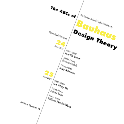
Specific feedback from my Peer: The text is clear. They like how I bold up the name. It is nice, they prefer the left one instead of the right one because the information is more clear. There was a problem of the sequence that they will read it as ABC of open theatre. 

week 2 (29.3.2021)
General feedback:
  • remember to update blog 
  • make sure separate the progress work and the final work. 
  • 0.5 pt stroke for outline artboard
  • Be careful on the background color 
  • be careful on using graphic element to make sure it's functional
Specific feedback from my Peer:
  • For the axial system, my peer said my axis system is nice, have nice hierarchy.
  • For the radial system, they said it's nice, but Man Ling suggested me not to use condensed font, but the regular one. 
  • For the grid system, they say my attempt 3 is better. For the bilateral, they like the attempt 4 better.
  • For the dilatation, they spotted my wrong spelling of the word 'Design'.
  • For Dilatation, they like my attempt 2 better as it has the sense of movement. 
  • For the modular, Tara suggested me to change the placing of 'the ABCs of' with 'Bauhaus design Theory' to make it more readable. Man Ling suggest me to bold the name to make it different with the time to let it have hierarchy. 
  • For the random system, they like my attempt 2 better. 
  • For transitional system, they like the attempt 3 better as the attempt 1 and 2 doesn't have the hierarchy. 
  • I asked Tze Earn for my design and she commented on my use of colors, that why do I use green, that must have a reason. 

week 3 (12.4.2021)
General Feedback: 
  • make sure that you trace accurately from the picture that you chose
  • need to make sure that the letters are not loosing the characteristic from the picture. 
Specific feedback from Mr. Vinod:
  • good job at the extraction 
  • good job at the refinement 
  • excellent work
  • The counter spaces looks a lot better at the second last attempt
  • I went a step too far
  • Need to make sure the stroke are consistent, but the shapes looks consistent, need to have a clearer picture to see if the stroke are consistent
Specific feedback from PEER: 
  • the third last attempt looks nicer
  • suggested to keep the round shape of the original letters, that have more on the leave feelings. 
week 4 (19.4.2021)
Specific feedback from Mr. Vinod:
  • the palm tree is awesome la, don't need to say anything ;)


REFLECTION

week 1 (29.3.2021)
Experience: This week is the first week that we meet Mr. Vinod again from typography class in semester 1. I feel relax as I already know what is the expectation of Mr. Vinod. However, I know myself that I am not really good at typography, so I was a little bit nervous that I will not do well in the class. I will try my best. HAHAHA. Anyways, I have a good experience in class. Although we are having a lot information to digest in class, while looking through the projects that we will do in future, I feel excited and look forward to see how it will turns out like. 
Observation: While doing the exercises that Mr. Vinod asked us to complete, I notice that it is hard to get the words align and keep in the grid while doing some of the typographic system. You need to be careful on the details on work that make things align and easy to read. 
Finding: I found out how to type on path tool in InDesign and I notice that designing in InDesign is quite different in Illustrator, as I thought some of the tool would be the same but it is not. However, I managed to find them out by searching and learn from internet and tutorial in YouTube, they are really helpful.

week 2 (5.4.2021)
Experience: For this week, I feel a little bit lost as I don't know if I am doing well. I think the peer system are going quite well, as I am the same room with Man Ling, Jocelin ,Jia Yee, Tara and others ( Sorry that I couldn't remember your name ;-; ). I feel like Man Ling is the one who hyped up our room that make us have a lot of fun whole doing the peer evaluation. They did give me some feedback that I didn't notice while doing the exercise. As for Task 2 part 1, I found that finding font are actually quite fun to do. Although the result is not what I thought of at the beginning, I did learn something from this exercise to observe the picture. 
Observation: Observation is one of the biggest thing in this week as we need to observe the pictures and find the alphabet from it. During the observation time, I found out that the negative and positive space in the letters are also very important to have the contrast. 
Finding: I notice that I don't remember how to create lines to guide me to create the font. As Mr. Vinod told us in the last class in Typography, he said 'U will forget everything that you learned.' Yes, I did. This is when you need your blog. I used my blog from semester 1 as a reference on how to create a font. However, I still remember how we need to keep the stroke consistent and the weight should be the same. 

week 3 (12.4.2021)
Experience: In this week, I feel glad that Mr. Vinod have positive comment on my work hoho. It reminds me on the typefaces creation in semester 1 which I worked until 5am morning and having class at 9am the same day ;-;. It is an unforgetful memories. Therefore, I am really happy that I managed to have sleeping time in this exercise and get positive comments from my peers and Mr. Vinod. Not gonna lie but while tracing the photo is the most satisfying stage in this whole exercise for me. Taking my time, slowly trace it out while watching movies. 
Observation: This exercise had showed that typography is everywhere. We could find inspiration from our daily life, even a piece of leaf. I don't know if it's just me, but whenever I walk an the street, I started to look at the alignment of the advertisement. Last week, while I was hanging out with my friend, she was asking me why am I staring at the restaurant advertisement board. I told her, look at the alignment, the price should be align with the text. I think this is also one of the important thing that I learn from typography, that if I am designing anything in future, I will make sure the text is aligned.
Finding: As I just making some adjustment at this week, I found that actually there are a lot of mistake in my typeface design. The details of the type is also very important. Small changes can affect the whole thing. I am glad that we have another week for me to make changes on the mistake. 

week 4 (19.4.2021)
Experience: In this week, we have consultation session with our peers and some from Mr. Vinod on our previous exercise. After that, we were briefed about Task 2 part 2 type and play. We did a 30 minutes exercise in class as well. I think my first attempt is not that good, I feel really lost at first as well. After that, I did another 2 attempts. I think it turns out quite well and I did use the technique that I learned from semester 1 DPI module. I am really glad that I haven't forgot those technique. 
Observation: I noticed that apply words onto pictures requires a lot of thinking as well. Finding pictures that could express well is hard, that I saved a lot of pictures and try but it still cannot work. It was hard. 
Finding: I found that I really like to use Futura font, especially when it comes to poster. Futura always come to my mind. It is so beautiful, simple and impactful. While I was doing the exercise, I found that Photoshop makes the type pixelized and it is different from Illustrator that we could look into very detail. Changing color and font type in Photoshop also a little bit frustrating because u need to change it one by one, not like illustrator that could change it all at once. 


FURTHER READING

fig 2.1 Vignelli Canon on Design

Below are the notes that I took while reading:

week 1 (29.3.2021)
  • creativity needs the support f knowledge to be able to perform at its best. 
  • its extremely important for a satisfactory result of any design to spend time on the search of the accurate and essential meaning, investigate their complexities.
  • Whatever we do, if not understand, fails to communicate and is waste effort. 
  • The discipline of Design is one and can be applied to many different subjects, regardless of style.
  • Design is a discipline, a creative process with its own rules
  • There are infinite possibilities to achieve a powerful expression. 
  • Visual strength is an expression of intellectual elegance and should never be confused with just visual impact.
  • As designers, we have three levels of responsibility: One- to ourselves, the integrity of the project and all its components. Two- to the Client, to solve the problem in a way that is economically sound and efficient. Three - to the public at large, the customer, the user of the final design.
week 2 (5.4.2021)

fig 2.2 screenshot from Vignelli Canon on Design
  • A real Corporate Identity is based on an overall system approach, not just a logo. 
  • When a logo has been in the public domain for more that 50 years, it become a classic, there is no reason to throw it away, no matter how well it has been designed. 
  • Out of thousands of typefaces, all we need are a few basic ones, and trash the rest. O.O ( Garamond, Bodoni, Century Expanded, Futura, Times Roman, Helvetica) Among these font, my favorite for now is Futura and Helvetica. 
  • White space is very important element in graphic composition. Another is the relationship among type sizes in the same page. 
  • Type weights can be used to great advantage when dedicated to a specific function. 
  • Design means to be in control of every detail and scale is one of the most relevant ones. 

week 3 (12.4.2021)

fig 2.3 'Artifact' 

This week, I found a pdf from the file section in Facebook group. It is a article that wrote by Sofie Beier from The Royal Danish Academy of Fine Arts, School of Design. This article is about understand hoe the design process work. A study of the English printer and type founder John Baskerville (1706-1775) way of working with a model for a contemporary design process.

  • The idea that good design is synonymous with great concept development was not always part of the typographical culture. 
  • Every designer has their own variation of the design process; the more experienced the designer is, the more the design process with turn into an intuitive operation where the designer freely shifts back and fort between stages.
  • the designer will have to produce some form of solution before truly understand all aspects of the design problem.
  • Many early web pages looked like printed pages
  • Japanning is a European imitation of Asian lacquer-work. It is based on a heavy, often black lacquer that almost looks like enamel paint. 

Comments

Popular Posts