Design Principle / Exercise

25.8.2020 - 02.10.2020 (week 1 - week 6)
Phoebie Ng / 0341172 / Bachelor of creative media
Design principle
Exercises
Phoebie Ng / 0341172 / Bachelor of creative media
Design principle
Exercises
LECTURES
week 1(25.08.2020)
Element of
design
- Line
continuous
mark made on a surface
- Shape/form
self
contained defined area, 2D element with area on a plane
- Size
the
relationship of the area occupied by one shape of that to another
- Space
the
distance between element
- Color
visible
spectrum of radiation reflected from an object, refer to hue
- Value
how
light or dark an object, refer to tone
- Texture surface
quality of a shape, how it appears to feel. Texture can real or implied.
Principles of design what we do to
the elements of design
- Emphasis
created
by visually reinforcing something we want audience to pay attention to.
Often use to train viewer eyes on the center of interest. Create degrees
of important are contrast of value, use of color, placement, variation,
size, contrast.
- Balance
the
distribution of interest or visual weight in a work. To have a sense of
visual equilibrium or stability. Symmetrical, asymmetrical or radial.
Element can be used in create balance in a composition.
- Contrast
the
juxtaposition of opposing element. The greater the contrast, the more
something will stand out.
- Repetition of element
create interest. Tying together individual elements and bring a sense of
consistency. It can create rhythm and patterns.
- Movement
visual
flow through composition. Movement is implied by the use of element ,
direct viewer eyes to move along.
- Harmony brings
together a composition with similarity and related elements. They work
together and complement each other
- Unity
created
by using harmonious similarity and repetition, continuance, proximity and
alignment. The visual linking of various element of the work.
Gestalt
Principles
- Closure(reification)
we
prefer complete shapes, so we automatically fill in gaps between elements
to perceive a complete image.
- Common
region group elements that are in the same closed region. Include
related objects in the same closed area to show they stand apart from
other groups.
- Figure/
Ground we dislike uncertainty, so we look for solid, stable items.
- Proximity
we
group closer together elements, separating them from those farther apart.
When you cluster individual elements into one area, the viewer will think
it as a entity standing distinct from
anything else on screen.

fig 1.1 design principles 25/8/2020
Contrast
- Contrast is
attractive to the eye
- Contrast aids
organization of information
- Contrast
creates a focus
- apply the principle of balance and proximity
- occur when 2 elements on a page are different

fig 1.2 contrast examples 25/8/2020
Gestalt
Principles
- Closure(reification) we prefer complete shapes, so we automatically fill in gaps between elements to perceive a complete image.
- Common region group elements that are in the same closed region. Include related objects in the same closed area to show they stand apart from other groups.
- Figure/ Ground we dislike uncertainty, so we look for solid, stable items.
- Proximity we group closer together elements, separating them from those farther apart. When you cluster individual elements into one area, the viewer will think it as a entity standing distinct from anything else on screen.
|
| fig 1.1 design principles 25/8/2020 |
Contrast
- Contrast is attractive to the eye
- Contrast aids organization of information
- Contrast creates a focus
- apply the principle of balance and proximity
- occur when 2 elements on a page are different
|
| fig 1.2 contrast examples 25/8/2020 |
week 2(04.09.2020)
Emphasis is used to create dominance and focus in a design work. Various elements can be used to create emphasis, such as color, shapes or value, to achieve dominance
Balance refers to the distribution of visual weight in a work of design. It is the visual equilibrium of the elements that causes the total image to appear balanced Balance can be symmetrical or asymmetrical.symmetrical balance has equal weight on equal sides of a centrally placed fulcrum. The equal arrangement of elements on either side of the central axis ( horizontal or vertical ) resulting in bilateral balance. Arranging elements equally around a central point results in radial balance. Approximate symmetry is when equivalent but not identical forms are arraigned around the fulcrum line.
- asymmetrical balance involves placement of objects in a way that will allow objects of varying visual weight to balance one another around a fulcrum point. For example, a cluster of small object balanced by a large object.
The golden ratio is a mathematical concept and a number that goes on in definitely. The golden ration has been used for centuries as a guide to create visual balance in architecture and paintings. The golden ratio can be used to bring harmony, balance, structure to one's work.
Rule of thirds is a simplification of the golden ratio, a composition guideline to create more dynamism to a work of design. An image is divided evenly into thirds, both horizontally and vertically, and the subject is placed at the intersection of those dividing lines, or along one of the lines itself.
Emphasis is used to create dominance and focus in a design work. Various elements can be used to create emphasis, such as color, shapes or value, to achieve dominance
Balance refers to the distribution of visual weight in a work of design. It is the visual equilibrium of the elements that causes the total image to appear balanced Balance can be symmetrical or asymmetrical.
- symmetrical balance has equal weight on equal sides of a centrally placed fulcrum. The equal arrangement of elements on either side of the central axis ( horizontal or vertical ) resulting in bilateral balance. Arranging elements equally around a central point results in radial balance. Approximate symmetry is when equivalent but not identical forms are arraigned around the fulcrum line.
- asymmetrical balance involves placement of objects in a way that will allow objects of varying visual weight to balance one another around a fulcrum point. For example, a cluster of small object balanced by a large object.
The golden ratio is a mathematical concept and a number that goes on in definitely. The golden ration has been used for centuries as a guide to create visual balance in architecture and paintings. The golden ratio can be used to bring harmony, balance, structure to one's work.
Rule of thirds is a simplification of the golden ratio, a composition guideline to create more dynamism to a work of design. An image is divided evenly into thirds, both horizontally and vertically, and the subject is placed at the intersection of those dividing lines, or along one of the lines itself.
week 3.11.09.2020)
Repetition Repetition could make a work of design seen active. The repetition of elements of design create rhythm and pattern within the work. Variety is essential to keep rhythms exciting and active, and to avoid monotony. Pattern increases visual excitement by enriching surface interest.
Movement The way a design leads the eye in, around, and through a composition - the path the eye follows. Motion or movement in a visual image occurs when objects seem to be moving in a visual image. Movement in a visual image comes from the kind of shapes, forms, lines, and curves that are used.
Hierarchy & Alignment Alignment is the placement of elements in a way that edges line up along common rows or columns, or their bodies along a common centre. Alignment creates a sense of unity and cohesion, which contributes to a design's overall aesthetic and perceived stability. Alignment can also be a powerful means of leading a person through a design.
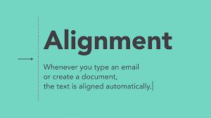
fig 1.3 alignment explanation 11/9/2020
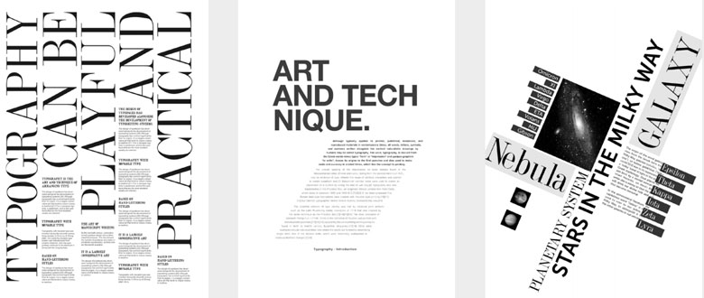
fig 1.4 alignment examples 11/9/2020
Repetition
Repetition could make a work of design seen active. The repetition of elements of design create rhythm and pattern within the work. Variety is essential to keep rhythms exciting and active, and to avoid monotony. Pattern increases visual excitement by enriching surface interest.
Movement
The way a design leads the eye in, around, and through a composition - the path the eye follows. Motion or movement in a visual image occurs when objects seem to be moving in a visual image. Movement in a visual image comes from the kind of shapes, forms, lines, and curves that are used.
Hierarchy & Alignment
Alignment is the placement of elements in a way that edges line up along common rows or columns, or their bodies along a common centre. Alignment creates a sense of unity and cohesion, which contributes to a design's overall aesthetic and perceived stability. Alignment can also be a powerful means of leading a person through a design.
| fig 1.3 alignment explanation 11/9/2020 |
|
| fig 1.4 alignment examples 11/9/2020 |
week 4(18.09.2020)
Harmony & Unity Harmony involves the selection of elements that share a common trait. Harmony becomes monotony without variety. Unity occurs when these elements are composed in suck a way that they are balanced and give a sense of oneness, creating a theme. Harmony and unity work hand in hand.
fig 1.5 harmony examples 18/9/2020

fig 1.6 unity examples 18/9/2020
Proportion Proportion is the relationship of two or more elements in a design and how they compare with one another. Proportion is said to be harmonious when a correct relationship exists between the elements with respect to size or quantity. The effective use of proportion in design often results in harmony and unity.

fig 1.7 proportion examples 18/9/2020
Harmony & Unity
Harmony involves the selection of elements that share a common trait. Harmony becomes monotony without variety. Unity occurs when these elements are composed in suck a way that they are balanced and give a sense of oneness, creating a theme. Harmony and unity work hand in hand.
|
| fig 1.5 harmony examples 18/9/2020 |
|
| fig 1.6 unity examples 18/9/2020 |
Proportion
Proportion is the relationship of two or more elements in a design and how they compare with one another. Proportion is said to be harmonious when a correct relationship exists between the elements with respect to size or quantity. The effective use of proportion in design often results in harmony and unity.
|
| fig 1.7 proportion examples 18/9/2020 |
week 5(25.09.2020)
Symbol
A sign, shape or object that is used to represent something else.
Abstract symbol can look like the objects that they represent but have less details.
Arbitrary symbols have no resemblance at all objects or ideas they represent .Invented and constructed. Many are based on geometric shapes and colors.
 |
| fig 1.8 symbol examples 25/9/2020 |
Imagery
Imagery is a vital part of design, be it print or digital. Users and viewers are able to relate to a concept or a brand if the right images are used in a work of design. It is therefore important to use suitable and relevant images when designing.
 |
| fig 1.9 imagery examples 25/9/2020 |
Typography
Typography is the design and arrangement of text to convey a message or concept. Successful use of typography will result in visual hierarchy and balance in a work of design.
 |
| fig 1.10 typography examples 25/9/2020 |
INSTRUCTIONS
TASKS
exercise 1
GESTALT AND CONTRAST
We were ask to create 2 designs based on gestalt principle and contrast principle with only black and white paper.
visual research
 |
| fig 2.1 gestalt and contrast visual research 04/09/2020 |
idea exploration
 |
| fig 2.2 research on contrast page 1 04/09/2020 |
 |
| fig 2.3 exploration on contrast page 2 04/09/2020 |
 |
| fig 2.4 exploration ideas on contrast 04/09/2020 |
 |
| fig 2.5 research on gestalt principle 04/09/2020 |
 |
| fig 2.6 exploration ideas on gestalt principle 04/09/2020 |
final design outcome
 |
| fig 2.7 final outcome on contrast 04/09/2020 |
 |
| fig 2.8 final outcome on gestalt principle 04/09/2020 |
This is the final design on gestalt principle which I chose to do closure principle, which it is not the full form of the entire thing but only the important parts of it. In order to do that, I then find a picture of an insect and trace out the important parts on it which you can clearly see the body, wings and also head, but I don't want to leave it simple like this, I also did add some details of it to make it looks more interesting. Therefore, you could see it is a dragon fly but it is not i it's full form but you can guess what it is.
exercise 2
EMPHASIS AND BALANCE
we were asked to created 2 designs of balance and emphasis. 1 for emphasis and 1 for balance, we are only allowed to used maker pens, color pencil and pens.
visual research
 |
| fig 2.9 visual research on emphasis 11/09/2020 |
idea exploration
 |
| fig 2.10 emphasis studies 11/09/2020 |
 |
| fig 2.11 emphasis idea explorations 11/09/2020 |
 |
| fig 2.12 balance idea exploration 11/09/2020 |
I had found these photo online as my reference photo.
 |
| fig 2.13 reference photo 11/09/2020 |
 |
| fig 2.14 reference photo 11/09/2020 |
final design outcome
 |
| fig 2.15 final outcome on emphasis 11/09/2020 |
I had use marker pen and pen to create this design. I had colored the ballet shoes with more color and details which it is the focus point I want to make which shows how people only focus on the beautiful side and for the injured leg, I just used 1 color of maker pen and pen to draw the outline. The message I want to send through this design is that we only focus on how ballet dancer bring us the beautiful dance but we always forgot that they really work hard on it, so we need to appreciate their hard work.
 |
| fig 2.16 final outcome on symmetrical balance 11/09/2020 |
 |
| fig 2.16 final outcome on asymmetrical balance 13/09/2020 |
For this design, it is seperate to 2 parts, which is the sky and the ground. I had used 2 different colors which is green and purple scheme. The sky and ground have almost the same amount of space which where the balance is showed. The color were also balanced as it has same amount of green and purple used.
exercise 3
REPETITION AND MOVEMENT
we were asked to created 2 designs of repetition and movement 1 for repetition and 1 for movement, we are only allowed to use pastel and watercolor.
visual research
 |
| fig 2.17 visual research for movement and repetition 18/09/2020 |
idea exploration
 |
| fig 2.18 movement studies 18/09/2020 |
 |
| fig 2.19 repetition studies 18/09/2020 |
 |
| fig 2.20 idea exploration 18/09/2020 |
I tried to do some sketches and study of repetition and movement . After that, exploring the ways to use watercolor and pastel. I quite like the oil pastel drawing at fig 3.3 because it is pop up in real life but it can't really seen in digital.
progression
reference photo
 |
| fig 2.21 photo reference 1 18/09/2020 |
 |
| fig 2.22 photo reference 2 18/09/2020 |
 |
| fig 2.23 photo reference 3 18/09/2020 |
 |
| fig 2.24 photo reference 4 18/09/2020 |
 |
| fig 2.25 photo reference 5 18/09/2020 |
 |
| fig 2.26 photo reference 6 18/09/2020 |
 |
| fig 2.27 photo reference 7 18/09/2020 |
These are the reference photo that I took myself.
final outcome ( first draft )
 |
| fig 2.29 first attempt on movement 19/09/2020 |
 |
| fig 2.30 first attempt on repetition 19/09/2020 |
final outcome final version
 |
| fig 2.30 final outcome on repetition 19/09/2020 |
For this design, I want to show the repetition of the key. I want to show the message of even a small little things in your life matter. House key is a things that are important but small. It is hard to produce a unique key for each house therefore they have their own unique parts.
 |
| fig 2.31 final outcome on movement 19/09/2020 |
For this design, I want to show movement, so I have draw 3 hands to make it looks like it is moving. I had used different shades of color, because I think when people are moving and the time would b different. Everyone will be different depends on the time going.
exercise 4
HARMONY AND UNITY
we were asked to created 2 designs of harmony and unity 1 for harmony and 1 for unity , we are only allowed to use poster color and acrylic.
visual research
 |
| fig 2.32 visual research 25/09/2020 |
idea exploration
 |
| fig 2.33 design principle study 25/09/2020 |
 |
| fig 2.34 design principle study 25/09/2020 |
 |
| fig 2.35 idea exploration 25/09/2020 |
 |
| fig 2.36 idea exploration 25/09/2020 |
Here are the idea exploration and studies that I did for harmony and unity.
progression
reference photo
 |
| fig 2.37 reference photo 25/09/2020 |
 |
| fig 2.38 reference photo 25/09/2020 |
progression
 |
| fig 2.39 progression 25/09/2020 |
 |
| fig 2.40 progression 25/09/2020 |
 |
| fig 2.41 progression 25/09/2020 |
 |
| fig 2.42 progression 25/09/2020 |
final outcome final version
 |
| fig 2.43 final outcome for harmony 25/09/2020 |
For this artwork, what I want to show is we should look at things from other perspective. So, I found an interesting photo from Pinterest, and recreate artwork from the picture.
 |
| fig 2.44 final outcome for unity 25/09/2020 |
exercise 4
SYMBOL,IMAGES AND TYPOGRAPHY
we were asked to created 2 designs of symbol, image and typography. 1 for symbol and 1 for image and typography , we are allowed to use any digital platform for symbol, but for image and typography, we need to do collage work for it.
visual research
 |
| fig 2.45 visual research 1/10/2020 |
 |
| fig 2.46 visual research 1/10/2020 |
Idea exploration
 |
| fig 2.47 idea exploration 1/10/2020 |
 |
| fig 2.48 composition exploration 1/10/2020 |
 |
| fig 2.49 composition exploration 1/10/2020 |
 |
| fig 2.50 composition exploration 1/10/2020 |
 |
| fig 2.51 composition exploration 1/10/2020 |
 |
| fig 2.52 word and image sketches 1/10/2020 |
 |
| fig 2.53 word and image sketches 1/10/2020 |
 |
| fig 2.54 word and image sketches 1/10/2020 |
final design outcome
 |
| fig 2.55 final outcome for word and imaging 1/10/2020 |
I think this shows more word and imaging than the first attempt. It is shows the bunny word with the outer look of bunny.
 |
| fig 2.56 final outcome for symbol 1/10/2020 |
For this symbol, I want to show happiness, so I did some research, it shows that blue birds is represent of happy and the overall look is a dream catcher, so what I want to show is happiness is being catch by us when you see this symbol.
FEEDBACK
week 2 : Ms Maria looked at my sketch book and my e portfolio, and she said I should rearrange my e portfolio and resize the photos in my e portfolio. Other than that, I need to upload my 2 designs into google classroom.
week 3 : Ms Maria looked at my e portfolio and my work, she said that my design is nice and I need to create another design for asymmetry balance.
week 4 : Ms Maria looked at my e portfolio, and she said that my work for repetition is different from other which I am creative but it is not that fine as the boxes there are messy, so she ask me to not fill in the boxes with dark colors.
week 5 : Ms Maria looked at my final outcome for exercise 4, she said that my works are really nice, She love it. The fish painting shows unity. For what I can improve is that I could add some stroke for the sun from what I had done for principle studies.
week 6: Ms Maria said that I should have my purpose of doing the symbol and my work for image and typography is not correct and she had showed me example of how to correct my work.
REFLECTION
week 2
Experience : I had gain some experience of how to apply design principle in design through out the first week and the restriction of we only can use black and white paper help me understand of how should we work on the material that we are given.
Observation : I learned some design principle through out this week and it is nice that we have the freedom of designing what design we want, so we could explore and observe what we want to have in our design
Finding : I had found out that design are not just for the beauty of visual but also it contained principles in it to make it look more attractive.
week 3
Experience : I had gain knowledge of balance and emphasis. It is not the first time I use marker pens to draw but it is still hard, but I definitely gain experience on using marker pen to create designs.
Observation : I noticed that using marker pens to draw could be difficult and I had found a trick which u should use the lightest color first then slowly to the dark color.
Finding : I think it is nice for this course to let us use different material for each exercise because I could explore more about different material
Experience : I had gain knowledge of how to use watercolor. I doesn't really have much experience with watercolor as I also avoid using watercolor because I don't know how to use it. I always choose the material that I more comfortable with last time.
Observation : I had noticed that how could water color and soft pastel work together.
Finding : I found that watercolor are not that easy to control compare to marker pens that I used because watercolor would spread a lot ifI put too many water and it is not that easy to use.
week 5
Experience : I think I had a great experience this week because I really love to paint acrylic and this exercise gave me a chance , so I am really happy to do something that I like to do.
Observation : I notice that it is better if you have a lot of idea exploration, so than you can pick whatever you want there rather than proceed to final outcome straight away.
Finding : I found that pointillism is a great art movement to use. Although I am using basic color, but when they all combine together, it creates a good artwork. I found that design principle is actually the module that I like the most in the semester because it is not restricting my creativity and the artwork that I want to produce.
week 6
Experience : I think I had a good experience by doing research on different symbol online . I think it is kind of fun to find pictures from magazine and combine them to recreate a new artwork.
Observation : I notice that every symbol have their own meaning behind, every element in symbol have its purpose on it.
Finding : I found that collage need to have different composition before sticking on it would be better so that you will not regret on it.


Comments
Post a Comment